PEP Housing
PEP Housing is a non-profit corporation, dedicated to providing limited-income seniors access to affordable quality housing with supportive services and advocacy.
PEP’s outdated brand was ready for a makeover to match the caring quality of services they provide.
Logo: The graphic design for the new logo recognized PEP’s history but gave it a fresh, warm and friendly feel. The overlapping house shapes double as upward arrows, which represent positive upward growth. The heart dots the “i” in housing to represent the caring communities. The new tagline, “Building community from the heart” defines PEP Housing in many ways, from the way they design, build and manage to how they serve their residents. The colors represent their innovative green building practices. Icons were drawn to accent areas of service and interest.
PROJECT DETAILS
Rebrand
Logo
Print: Annual report, newsletter, stationary, event materials
Website


Website: The PEP Housing website was revitalized with color and photos from the communities and residents. Its user-friendly format makes it easy for people to apply for residency, to volunteer or find out how to bring PEP Housing into their community.
WEBSITE TEAM
Graphic Design: Hansen-Kemp Design
Web Development: ROI POP
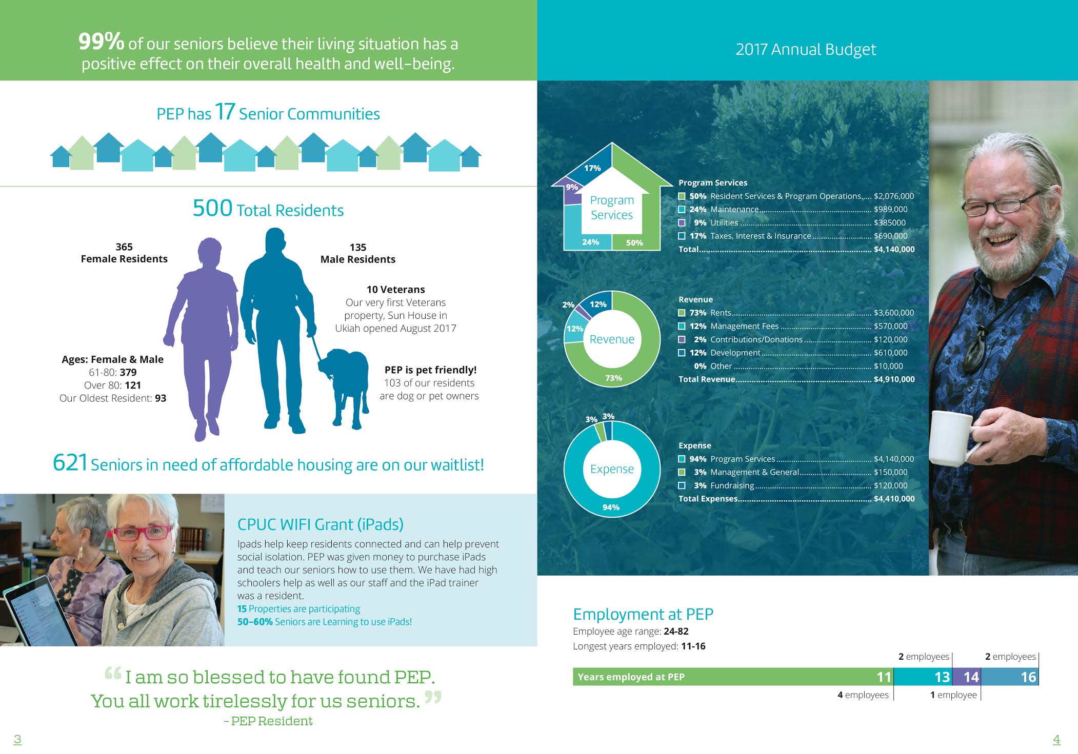
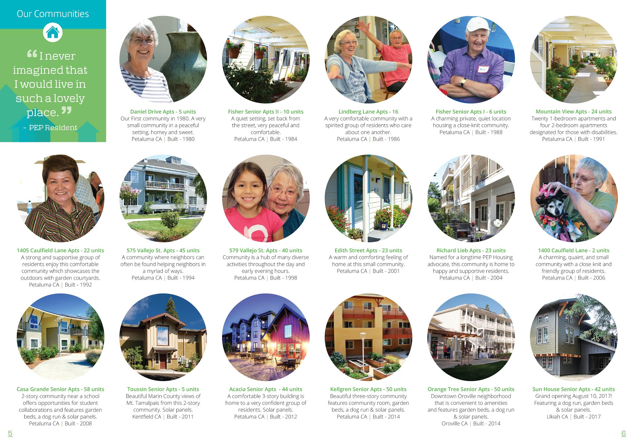
Print: The upbeat color and design carries through to the print collateral. An informative annual report presents information through charts and infographics.


